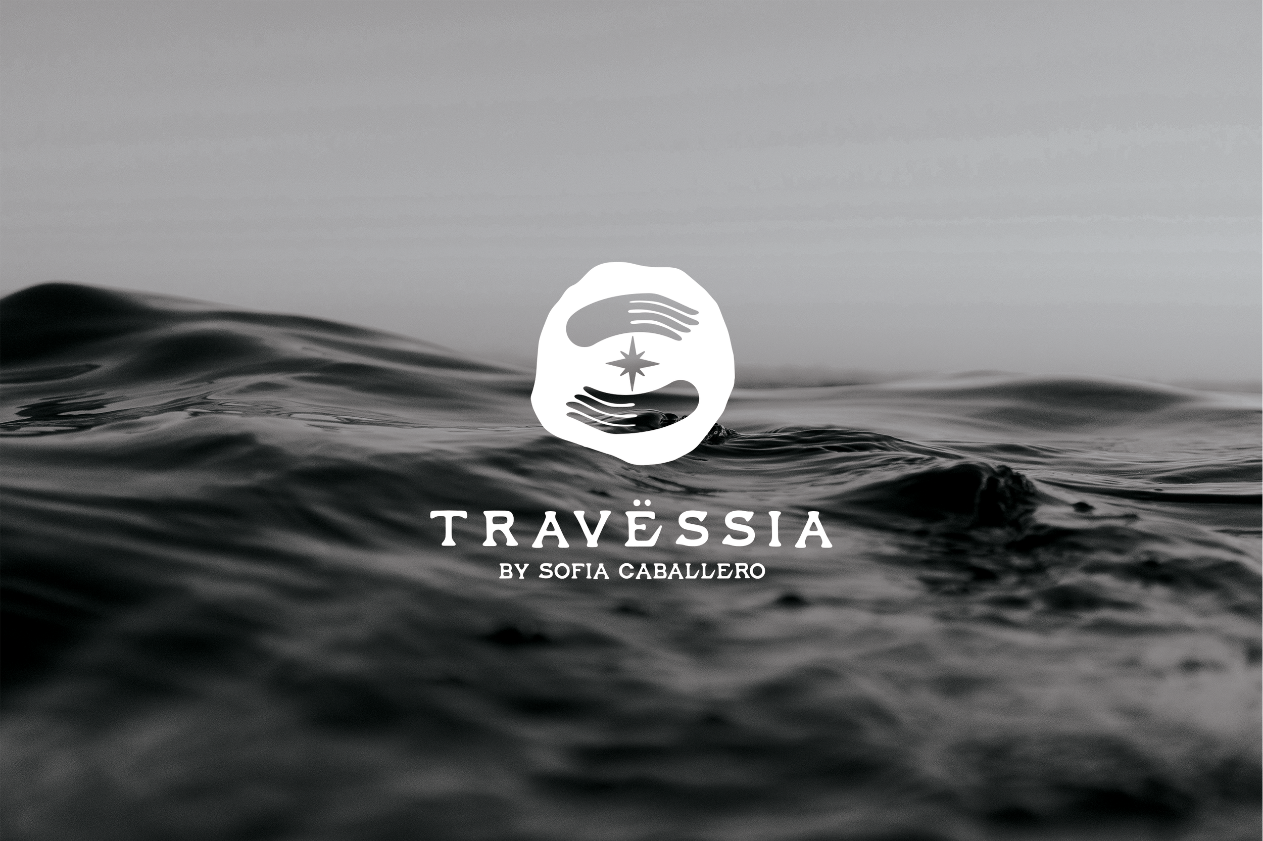
The branding for Travessia captures the essence of exploration and cultural immersion, aligning with its mission to create personalized, meaningful travel experiences. The visual identity focuses on storytelling through clean layouts and natural, organic design elements that evoke a sense of adventure and authenticity.
Año
2024
Client
Travessia
The primary logo for Travessia was designed to visually encapsulate the brand’s core values: human connection, guidance, and exploration. The creative process was driven by the idea of a journey—not just physical travel, but also the emotional and personal experiences that come with it.
To bring this concept to life, I explored various symbols that resonate with the spirit of discovery. The final design integrates two hands, representing support and human connection, and a compass at the center, symbolizing direction, adventure, and purpose. This combination reflects the essence of Travessia as a boutique travel agency that provides more than just trips, it offers meaningful experiences and personalized guidance.

Personalized wine label for souvenir travel gift abstracting the star of the logo to make it feel more sophisticated, clean and elegant.
This Instagram feed for Travessia, was designed to evoke a sense of adventure, elegance and connection with nature. The visual style features the curated color palette of earthy tones chosen for travessia, including warm terracotta, sage green and beige, which reflects the brand's connection to natural landscapes and cultural experiences.
The layout balances immersive travel photography with informational posts and travel tips, creating a dynamic and engaging flow. Each post is thoughtfully designed with clean typography and ample negative space to maintain a minimalist, modern aesthetic. The use of overlays and frames enhances the storytelling while keeping the focus on the visual journey. This design invites users to explore the world with Travessia.
The design of this welcome card for Travessia focuses on creating a visually soothing and elegant experience that aligns with the brand’s philosophy. The minimalist layout ensures a clean, uncluttered look, while the ample white space draws attention to the message, enhancing readability and also using subtle font variations to create a natural hierarchy that guides the viewer’s eye.
The choice of a black-and-white photo was intentional to evoke timelessness and simplicity. Taking away distractions, allowing the viewer to focus on the subject’s texture, shape, and emotion adding visual interest without overpowering the design also bringing a sense of sophistication and nostalgia.


